
Payment Flow Redesign - Yirental
WHAT IS YIRENTAL
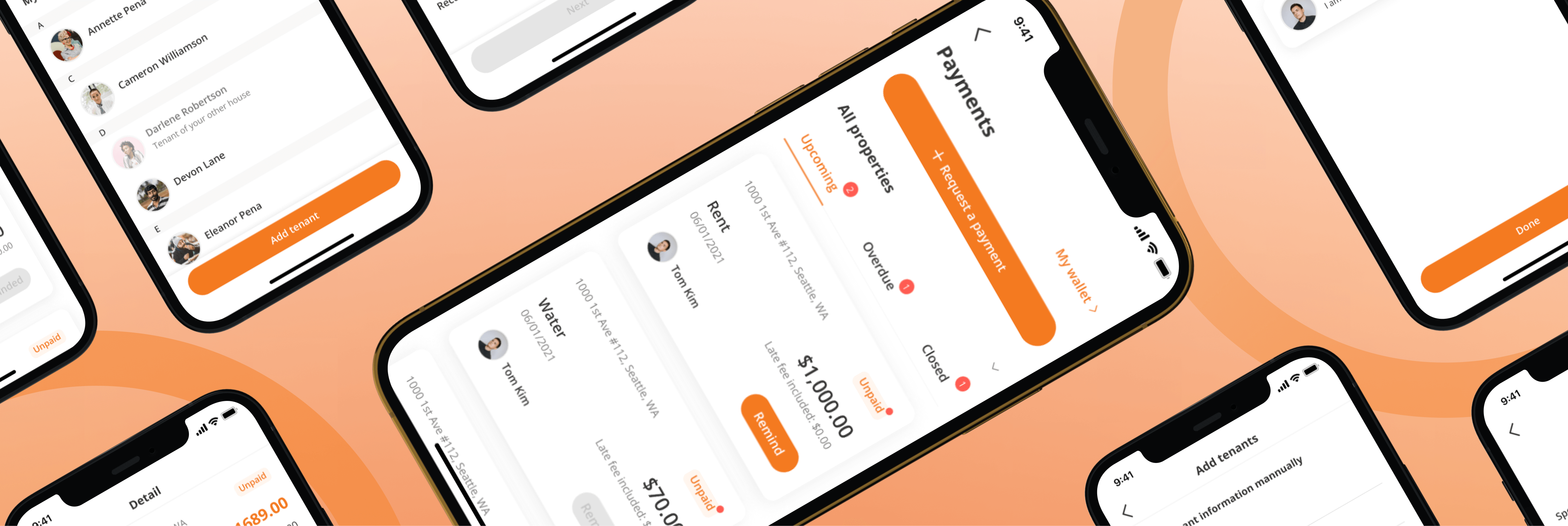
Yirental is a platform that connects renters with homeowners or property managers. This request payment flow project is part of the property management system that Yirental is developing.
TEAM
Moses - Product Designer
Yuan Zhuang - Lead Designer
Ming Zhu - Product Manager
ROLE
With feedback given by stakeholders & previous designer of the request payment flow, I desigend a condensed version of the flow and conducted usability testing to validate the design.
DURATION
8 Weeks (Jan 2022 - March 2022)
The Problem
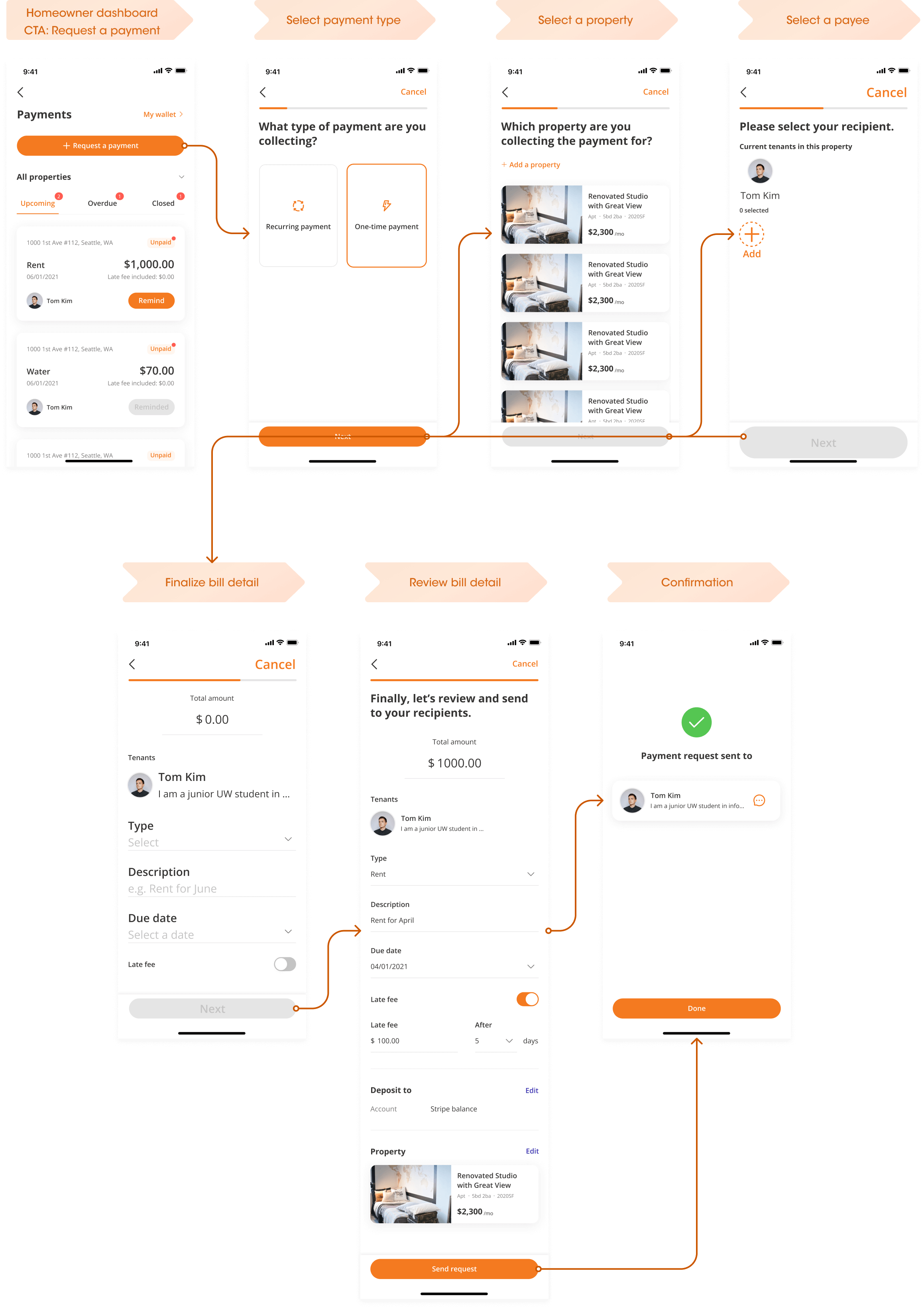
The drop off rate for the current flow is high. Upon understading the requirements from PM, we hypothesised that the exisiting flow has too many screens to complete. With an average drop off of 29% per screen.
One more challenge
From research findings, the previous design failed to let landlords set up a breakdown of the charge, which many tenants expect to see when viewing their monthly bill.
The Approach
Let's take a look at the previous design
Even the "happy path" takes seven screens to complete.
The Approach
Understanding the design rationale
I reached out to the designer of the original flow to understand the design decision. It was intentional that the design separate different selection categories into more screens to reduce cognitive overload for users.
What are users familiar with?
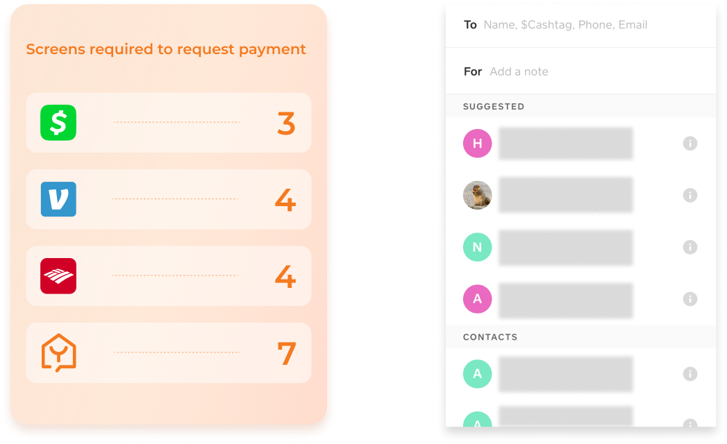
However, as the old design was not performing as ideal, I surveyed some commonly used payment apps to see how competitors are handling this issue.
Users are already used to only using 3 - 4 screens to request payment from others.
Proposed Design
Design Implication
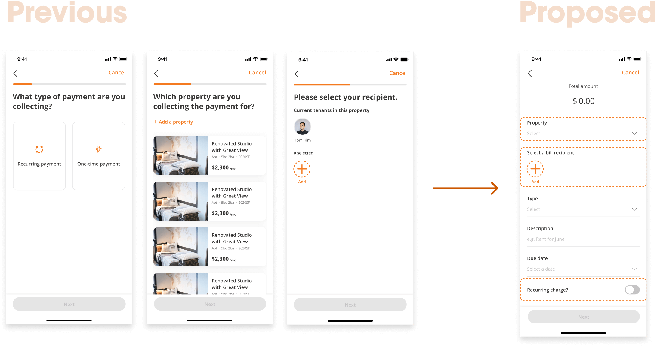
My approach is to aggregate several selection categories into one screen. Then test the proposed version vs the previous design to evaluate whether the new design is producing more cognitive overload for users.
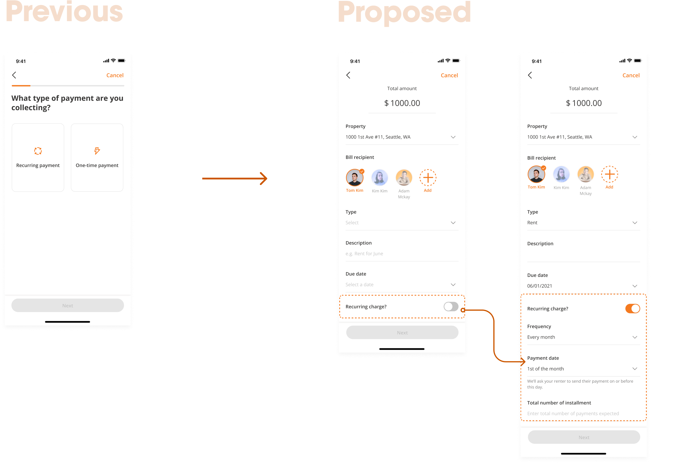
Setting up recurring charges
I redesigned the "type of charge" page into a toggle. When clicked, more information expands at the bottom.
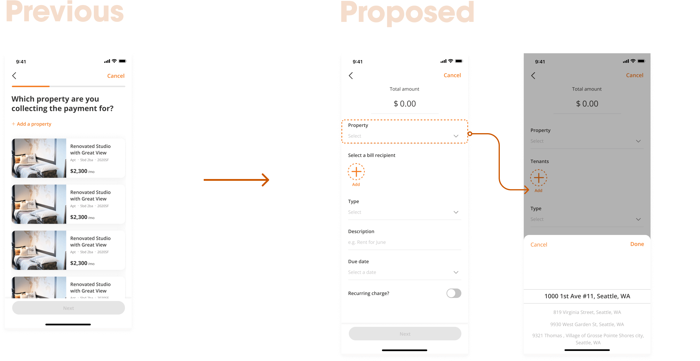
Selecting a property
Redesigned the property page into a smaller drop down in the detail page. Once clicked, a tab containing all the properties pops up from the bottom.
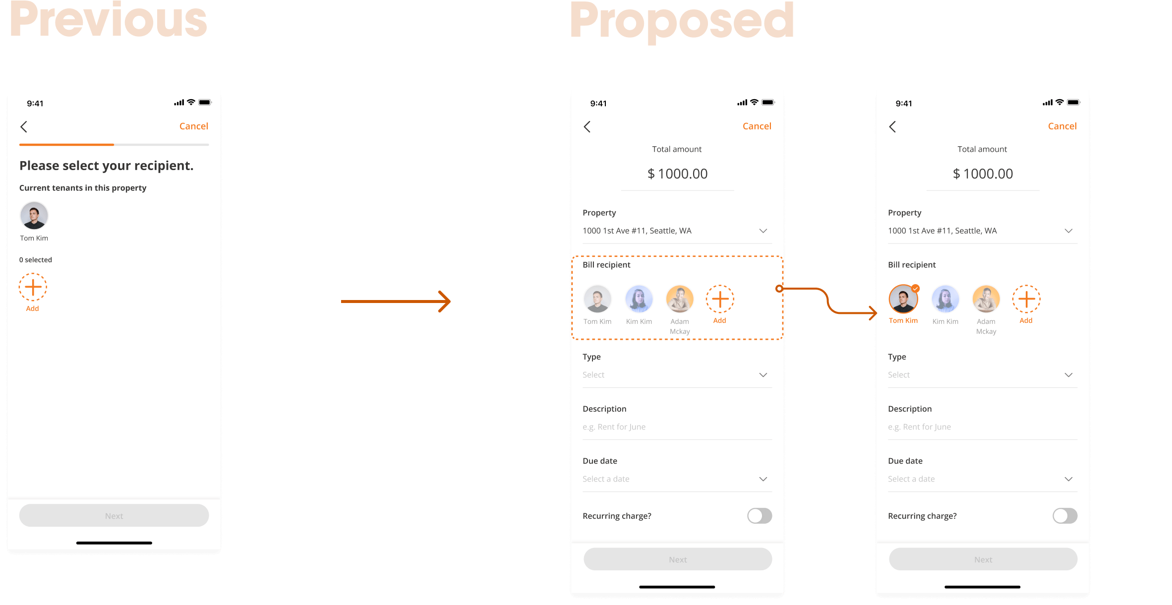
Selecting a payee
Current tenants of the property will automatically show up for homeowners to quickly select or deselect tenants.
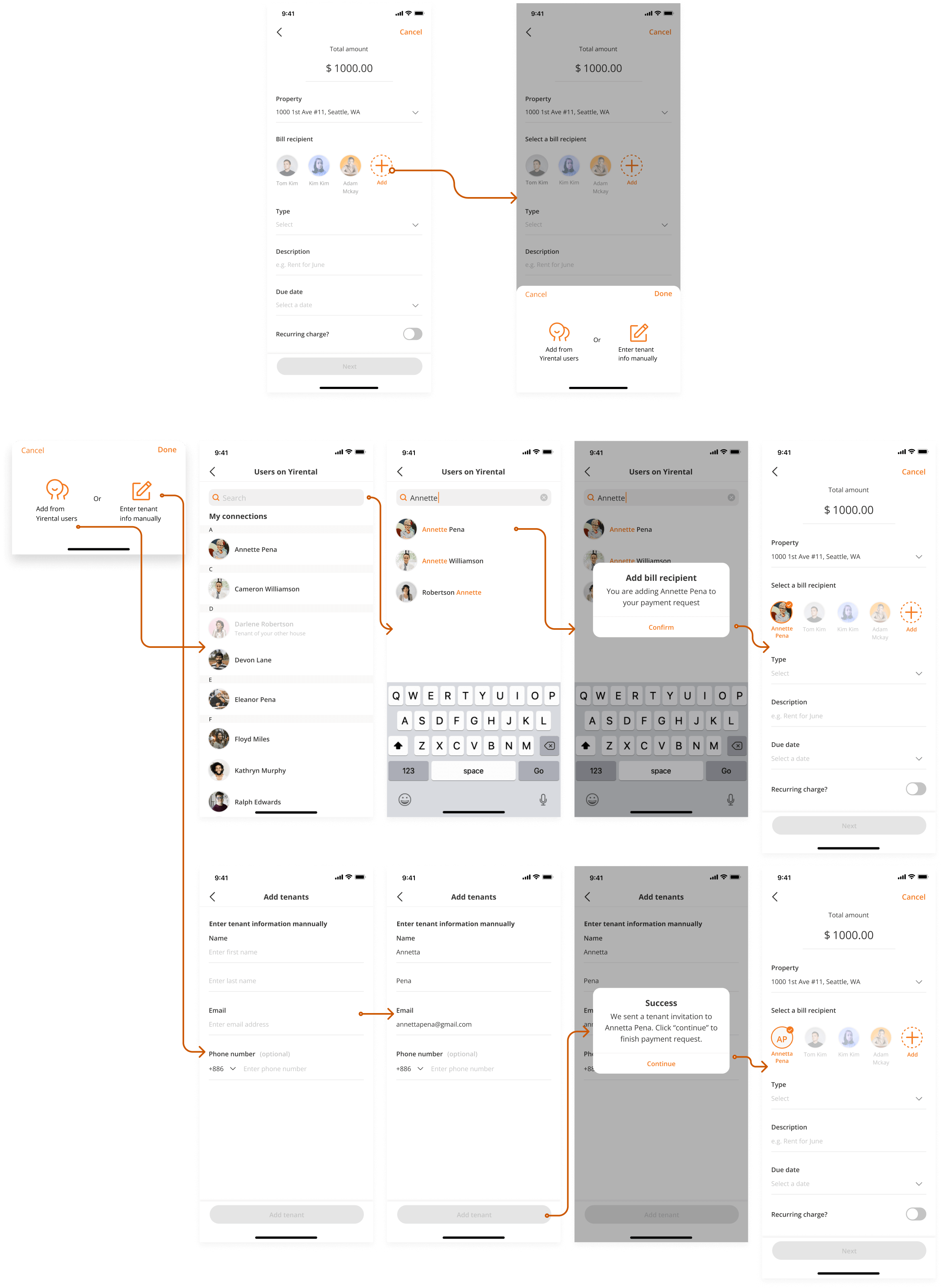
Edge Cases
What if a payee does not have an account on Yirental? Or their account is not linked to the property and therefore their profiles won’t show up when the landlord selects a property?
Testing
Testing our hypothesis
In collaboration with UXRs, We interviewed 10 participants: 5 for the previous design 5 for the proposed design to collect data such as time on task, wrong paths, user ratings, and verbal feedback.

01
What we found
Users rated the V0 design 8/10 and the average time on task is 49.6s; The proposed design received a rating of 8.2 and the average completion time is 47.2s. Indicating that aggregating multiple categories into fewer screen does not increase cognitive overload.
02
2 out of 10 test participants pointed out that to edit a previously selected category (tenant, payment type, property) in the previous design the user has to go back multiple screens. While the user can edit these data entries all in one screen in the new design.
03
6 out of 10 participants said that they expect to see a charge breakdown into categories such as (rent, utility, trash, parking, etc), and neither of the design includes this feature.
Iteration
Issue
Current design doesn't support a charge break down feature.
Constraints
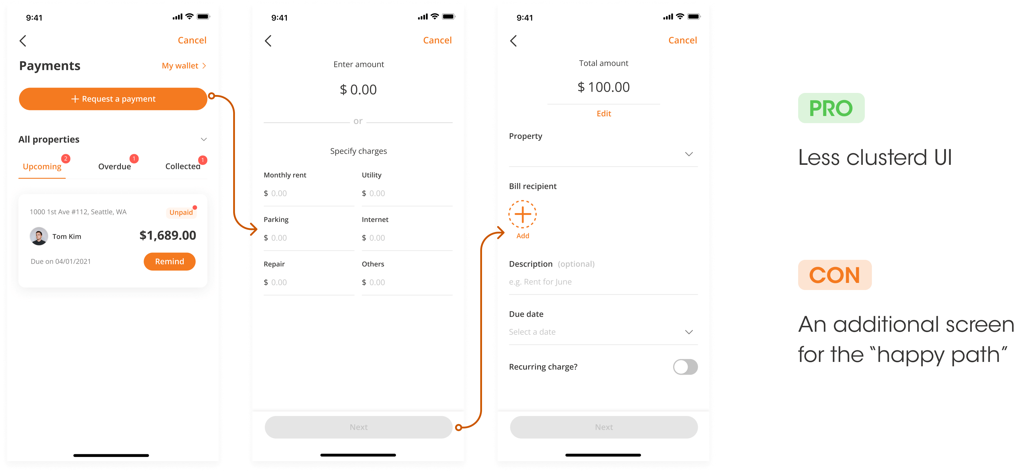
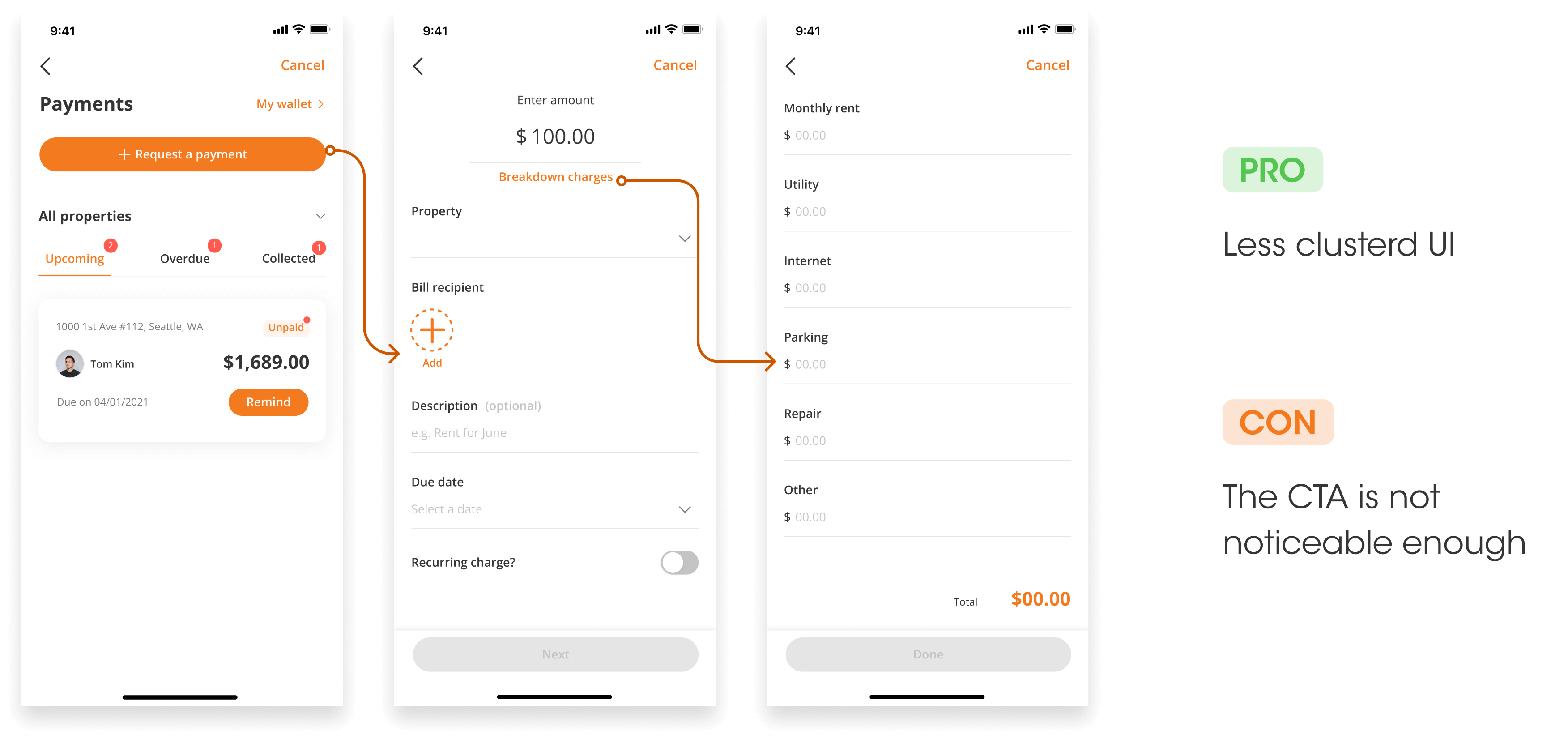
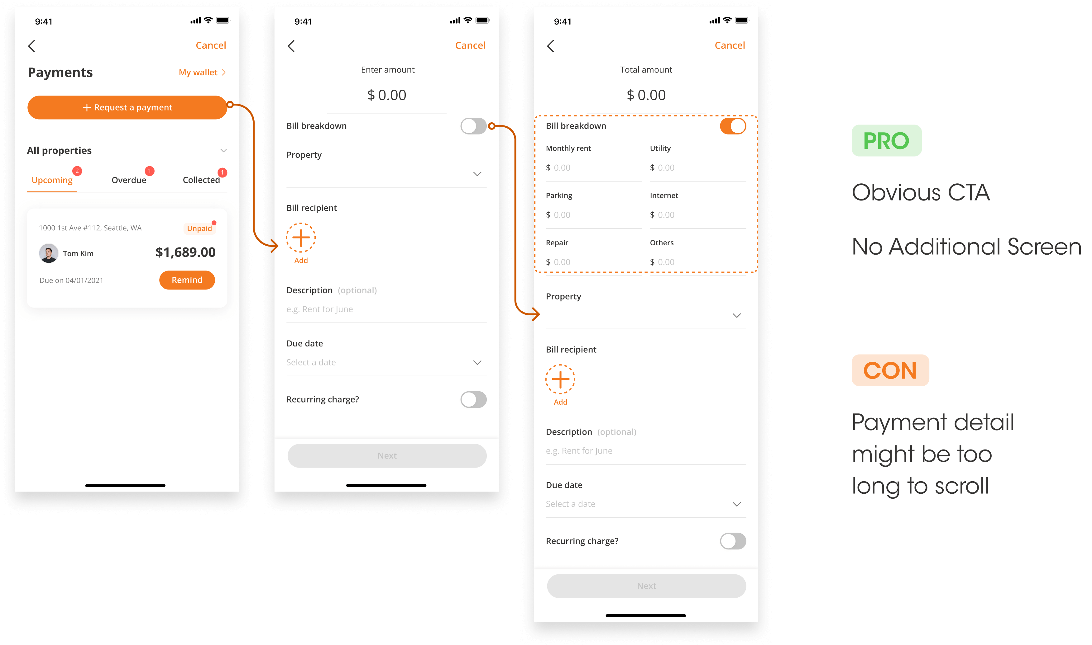
With reduced number of screen, adding a bill break down feature can be challenging. Therefore, I designed 3 variants and presented to stakeholders & peer designers to review.
Variant 1
Homeowners first specifies the charge amount, either directly
entering the amount or enter the charge breakdown, before
finalizing other payment details.
Variant 2
In the payment detail screen, homeowners have the option of breaking down the charges with an orange CTA button. Once clicked, a new screen dedicated to the charge breakdown will show up.
Variant 3
Homeowners have the option of breaking down the charges in the payment detail screen; but changed the CTA button into a toggle compared to the second variation and the charge breakdown list is right in the payment detail page.
Conclusion
Due to time constraints
We did not conduct another round of usability testing. I presented the three variants to stakeholders & peer designers, and evaluated them based on these criterias (see below). We decided to move forward with the 3rd variantis best for the reason of it takes the least amount of time and the overall interface is not too crowded.
As a next step, I screen recorded the flow in prototype mode with various use cases, and left annotations in the figma file for developers to review.
What would I do differently
If given more time, I would like to conduct another round of usability testing for the charge break down feature.
What I learned
• It is critical to consider different use cases and edge cases and provide design solutions for them.
• Provide variations of designs for the same problem. One of the remarks I received from weekly synced design meeting is that my peer designers appreciate the fact that I created different variations, this helped them understand the problem more clearly in terms of what is the trade-off.
© Moses Wan 2025
